
| 일 | 월 | 화 | 수 | 목 | 금 | 토 |
|---|---|---|---|---|---|---|
| 1 | 2 | 3 | 4 | 5 | ||
| 6 | 7 | 8 | 9 | 10 | 11 | 12 |
| 13 | 14 | 15 | 16 | 17 | 18 | 19 |
| 20 | 21 | 22 | 23 | 24 | 25 | 26 |
| 27 | 28 | 29 | 30 |
- 사전 가지치기
- 사후 가지치기
- 경사하강법
- boosting
- 캘리포니아주택가격예측
- 최소제곱법
- C4.5
- KNearestNeighbors
- Adaboost
- LeastSquare
- 회귀분석
- 의사결정나무
- 군집화기법
- LinearRegression
- gradientdescent
- 아다부스트
- 선형회귀
- 중선형회귀
- 부스팅기법
- MultipleLinearRegression
- 실제데이터활용
- cost complexity pruning
- 정보이득
- 체인지업후기
- AdaBoostClassifier
- 부스팅
- post pruning
- AdaBoostRegressor
- pre pruning
- 선형모형
- Today
- Total
데이터 분석을 향한 발자취 남기기
[Boosting] AdaBoost Classifier with Citrus 본문
오늘은 이전에 공부했던 AdaBoost Classifier를 구현하여 실제 데이터를 분류해보고 이를 시각화하여 표현해보고자 한다.
AdaBoost Classifier에 대한 알고리즘은 아래 링크를 통해 볼 수 있다.
https://footprints-toward-data-analysis.tistory.com/11
[Boosting] AdaBoost Classifier
Boosting의 대표적인 알고리즘인 AdaBoost 알고리즘에 대해서 알아보고자 한다. AdaBoost는 분류와 회귀 문제에 모두 사용할 수 있는 앙상블 모델로 오늘은 분류 문제를 다뤄보고자 한다. 1. AdaBoost Classi
footprints-toward-data-analysis.tistory.com
0. Citrus 데이터
1. AdaBoost Classifier 구현
2. Hand vs Sklearn 비교
3. 예측결과 시각화
0. Citrus 데이터
데이터는 캐글에서 불러와서 사용하였다.
https://www.kaggle.com/datasets/joshmcadams/oranges-vs-grapefruit
Oranges vs. Grapefruit
Orange and grapefruit diameter, weight, and color data.
www.kaggle.com
AdaBoostClassifier를 이용해 오렌지와 자몽을 분류하고자 한다. 데이터는 색상, 무게, 지름을 이용해 오렌지와 자몽을 분류하는 이진 분류 데이터이다. 총 데이터 개수는 10,000개로 구성되어 잇으며, 이중 데이터를 적절하게 섞어 500개의 데이터에 대한 분류를 진행하고자 한다. 만들어진 500개 데이터에는 "orange"가 246개, "grapefruit"은 254개로 이뤄져있다.
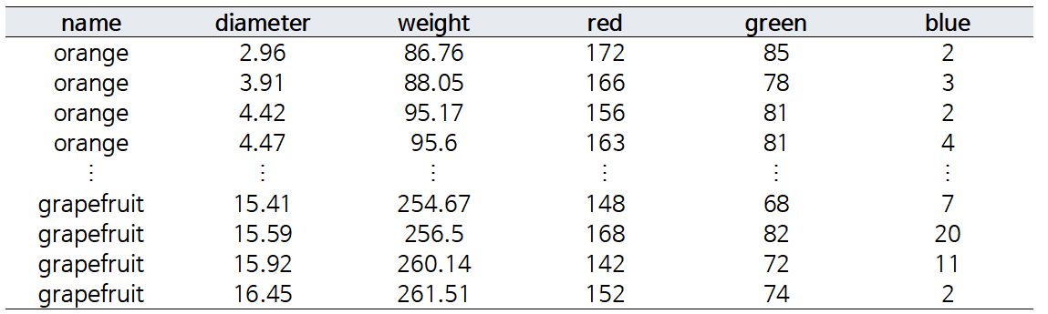
name 변수가 "orange", "grapefruit"으로 주어지는데, 이를 모형에 학습시키기 위해서는 수치형 변수로 변환해야한다. AdaBoost Classifier의 알고리즘을 고려해 {-1, 1}에 대응시키고자 한다.
- orange → 1
- grapefruit → -1
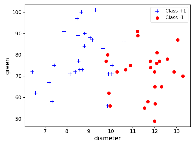
orange(1)는 빨간색, grapefruit(-1)은 파란색으로 표시했을 때, 피처들의 분포는 다음과 같다.
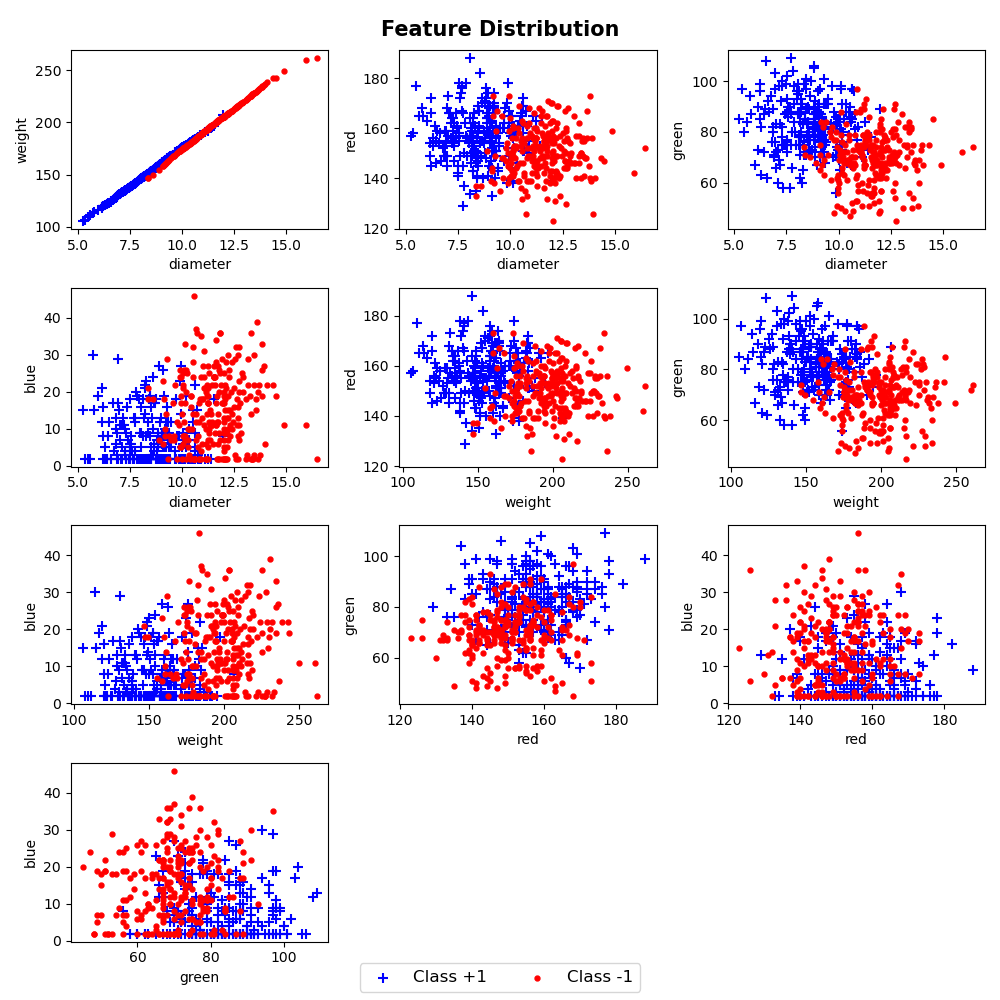
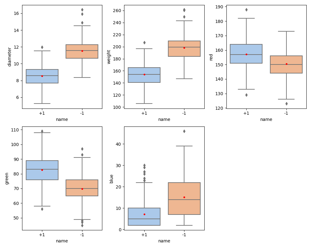
오렌지와 자몽을 정확하게 분류하는 피처 조합은 보이지 않으며, 대부분 중첩되어있음을 볼 수 있다.
그래프를 그리는 코드는 아래와 같다.
'''

orange vs grapefruit
boxplot

'''

import pandas as pd
import seaborn as sns
import matplotlib.pyplot as plt


# citrus.csv 불러오기
citrus_data = pd.read_csv('./citrus_500.csv')

# 그림그릴 때, 1 -> +1로 표시
citrus_data.name = ["+1" if x == 1 else x for x in citrus_data.name]

feature = ["diameter", "weight", "red", "green", "blue"]

fig, ax = plt.subplots(figsize = (10, 8), nrows = 2, ncols = 3)

idx = 0

# 각 변수마다 name 변수에 따라 박스플랏 그리기
stop = False
for i in range(2):
    for j in range(3):
        sns.boxplot(data = citrus_data, x = "name", y = feature[idx], ax = ax[i][j],
                    palette= "pastel", showmeans = True,
                    meanprops = {"marker":"o", "markerfacecolor":"red", "markeredgecolor":"red",
                                 "markersize": 3})
        idx += 1

        if idx >= 5:
            stop = True
            break

    if stop == True:
        break

ax[-1, -1].axis('off')
plt.tight_layout()


#%%

'''

orange vs grapefruit
scatter

'''

import pandas as pd
import matplotlib.pyplot as plt

# citrus.csv 불러오기
citrus_data = pd.read_csv('./citrus_500.csv')

# 4x3 그래프
row, col = 4, 3
fig, ax = plt.subplots(figsize = (10, 10), nrows = row, ncols = col)

# x축 피처와 y축 피처 위치 설정 (초기값)
# x축: diameter, y축: weight
col_idx, other = 1, 2

# 피처가 더이상 조합되지 않는 경우 stop = True로 변경
stop = False

# i번째 row에 j번째 col에 그래프 그리기
for i in range(row):
    for j in range(col):

        # 오렌지, 자몽 나눠 그리기 -> 색상, 마커 다르게 표시
        orange = citrus_data[citrus_data.name == 1]
        grapefruit = citrus_data[citrus_data.name == -1]

        # legend 표시를 위해 담기
        a = ax[i][j].scatter(orange.iloc[:, col_idx], orange.iloc[:, other], color = "blue", marker = "+", label = "Class +1",s = 50)
        b = ax[i][j].scatter(grapefruit.iloc[:, col_idx], grapefruit.iloc[:, other], color = "red", marker = ".", label = "Class -1", s = 50)

        # label 표시하기
        columns = citrus_data.columns
        ax[i][j].set_xlabel(columns[col_idx])
        ax[i][j].set_ylabel(columns[other])

        other+=1

        # x축: diameter, y축: weight 그리면 x축: weight, y축: diameter는 그리지 않음
        # (diameter, weight), (diameter, red), ... , (diameter, blue), (weight, red)
        # x축 변수에 대한 y축 변수가 벗어나는 경우 x축, y축 변수 다시 변경하기
        if other == 6:
            col_idx += 1
            other = col_idx + 1

        # 피처가 더이상 조합되지 않는 경우 루프 중단
        if col_idx >= 5:
            stop = True
            break

    # 중단 조건
    if stop == True:
        break

# 빈 그래프 출력 X
ax[-1, -1].axis('off')
ax[-1, -2].axis('off')

handles, labels = ax[1][1].get_legend_handles_labels()
fig.legend(handles, labels, loc='lower center', ncol = 2, fontsize = 12)
fig.suptitle("Feature Distribution", fontweight = "bold", fontsize = 15)
plt.tight_layout()
1. AdaBoost Classifier 구현
이제, 데이터를 분류하기 위해, AdaBoost Classifier를 사용하고자 한다.
이전에 공부했던 알고리즘을 토대로 구현한다.
코드로 구현한 결과는 아래와 같다.
import numpy as np
from sklearn.tree import DecisionTreeClassifier

class Adaboost:

    # 모델 몇 번 돌아갈지 설정 (set_iteration)
    def __init__(self, set_iteration = 50, random_state = False):
        self.set_iteration = set_iteration
        self.random_state = random_state

    ### fit: 모델 학습
    def fit(self, train_x, train_y):

        # weight: 처음 가중치는 1/n으로 둔다.
        weight = np.array([1/len(train_y) for i in range(len(train_y))])

        self.iteration = 0 # 실제 생성된 모델의 개수를 담기 위한 iteration
        self.model_list = [] # 각 iteration마다 학습된 모델 담기
        self.alpha_list = [] # alpha값 담기
        self.weight_list = [] # 가중치 저장하기 (선택사항)
        self.error_list = [] # 오분류율 저장하기 (선택사항)

	# random_state가 숫자로 설정되어있으면 샘플 고정
        if type(random_state) != bool:
        	np.random.seed(random_state)

        for i in range(self.set_iteration):

            self.iteration += 1

            # 가중치 저장하기
            self.weight_list.append(weight)

            # 복원추출
            # np.random.choice를 이용하여 각 train_data값이 가중치에 따라 인덱스를 뽑아내고 이를 통해 train_data로부터 추출한다.
            sample_index = np.random.choice(len(train_y), size = len(train_y), p = weight)
            train_sample_x, train_sample_y = train_x[sample_index], train_y[sample_index]

            # 샘플 데이터로 weak learner 학습
            # 이때, random_state가 지정된 경우 이를 반영함
            model = DecisionTreeClassifier(max_depth = 1, random_state = self.random_state) if type(self.random_state) != bool else DecisionTreeClassifier(max_depth = 1)
            model.fit(train_sample_x, train_sample_y)

            # 기존 훈련 데이터에 대한 예측값 생성하기
            predict = model.predict(train_x)

            # 오분류율 (잘못 분류된 가중치들을 모두 더해주기)
            error = sum([weight[i] for i, x, y in zip(range(len(train_y)), train_y, predict) if x != y])

            # 만약 error값이 0.5보다 크면 루프를 중단한다.
            if error > 0.5:
                break

            # alpha 계산
            # 이때, 분모에 오는 error가 0에 매우 가까우면 오류가 발생함 -> epsilon 더하기
            epsilon = 1e-10
            alpha = 1/2 * np.log((1-error+epsilon)/(error+epsilon))

            self.error_list.append(error)
            self.alpha_list.append(alpha)
            self.model_list.append(model)

            # 그다음 정규화한 weight(가중치)를 정의한다.
            weight = weight * pow(np.e,(-alpha*train_y*predict))
            sum_weight = sum(weight)
            weight = weight/sum_weight


    # 예측할 때 (모델의 예측값) * alpha 값들을 모두 더해주고 sgn을 적용한다(1, -1 사이 값으로 나타내기)
    def predict(self, test_x):
        self.predict_list = []

        for model, alpha in zip(self.model_list, self.alpha_list):
            self.predict_list.append(alpha * model.predict(test_x))

        final_predict = np.sum(self.predict_list, axis =0)

        # 최종 예측은 음수이면 -1 양수이면 1로 예측한다.
        prediction = np.array([1 if x > 0 else -1 for x in final_predict])
        return prediction
2. Hand vs Sklearn 비교
구현한 모델이 잘 만들어졌는지 알기 위해, sklearn의 AdaBoostClassifier와 성능을 비교해보려고 한다.
약분류기의 수는 모두 50개로 설정하고, random_state = 0으로 설정한다.
이때, train과 test는 랜덤으로 선택했으며, train:test = 7:3 비율로 설정하였다.
그 결과, sklearn과 Hand의 AdaBoost 분류기는 비슷한 성능을 보임을 알 수 있다.
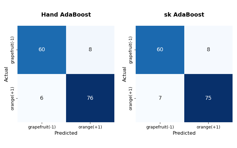
Hand는 sklearn보다 orange를 하나 더 맞췄음을 볼 수 있다. 수치적으로 성능을 비교하기 위해 가장 많이 사용하는 Accuracy를 사용한다.
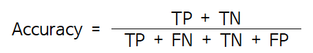
* 주의할점: 불균형한 데이터인 경우 성능을 비교할 때, Accuracy가 아닌 다른 성능 지표를 사용하는 것이 좋다.
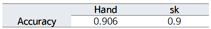
Accuracy가 0.9로 테스트 데이터의 90%는 제대로 분류해냄을 알 수 있으며, Hand와 sk 결과 또한 매우 비슷함을 볼 수 있다.
성능 비교를 통해, 구현한 AdaBoost 분류기가 제대로 생성되었음을 알 수 있었다.
AdaBoost는 약분류기로 stump tree를 사용하기 때문에, 이러한 특징을 이용해 분류 결과를 시각화하고자 한다.
3. 예측결과 시각화
AdaBoost는 훈련 시, 잘못 분류한 예제는 가중치를 더 크게, 잘 분류한 예제는 가중치를 더 작게 부여한다.
이를 점의 크기로 시각화하여 그리고자 한다.
단순한 데이터를 대상으로 보기 위해, 앞에서 사용한 train 데이터를 앞에서부터 50개만 사용하여 보고자 한다.
- diameter와 green
위와 같은 분포를 띄는 50개의 점에 대해서, 구현한 AdaBoost를 이용해 학습한다.
3개의 weak learner들을 조합한다고 가정했을 때, 분류한 결과는 다음과 같다.
(1) iteration 1
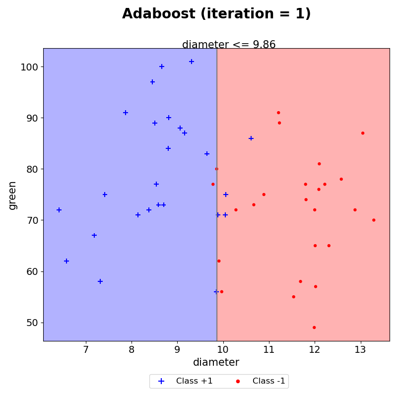
첫번째 iteration을 통해, diameter가 분류기준으로 설정되었다.
조건을 만족하는 경우 +1, 조건을 만족하지 않으면 -1로 예측한다. 그 결과, 총 5개의 데이터가 잘못 분류되었음을 눈으로 확인할 수 있다. 이때, 각 데이터에 대한 가중치는 모두 동일하므로 점의 크기 또한 모두 동일하다.
(2) iteration 2
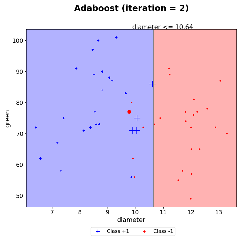
AdaBoost는 잘못 분류된 데이터의 가중치는 크게, 잘 분류한 데이터의 가중치는 작게 생성한다. 따라서, iteration 2에서는 잘못분류한 데이터의 크기가 커졌음을 볼 수 있다. 그 외 다른 데이터들은 모두 iteration 1보다 작아졌다.
새롭게 수정된 가중치를 기반으로 훈련할 데이터를 샘플링하기 때문에, 이전에 틀렸던 4개의 (+) 모양을 맞출 수 있도록 결정경계가 생겼음을 볼 수 있다.
이와 같은 작업을 iteration 5까지 하였다.
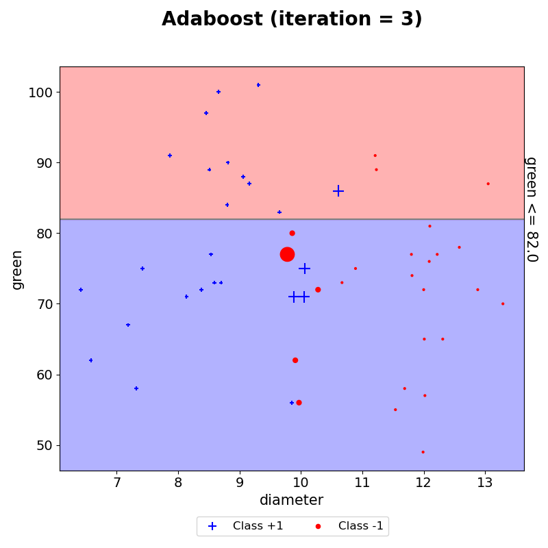
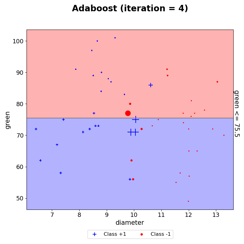
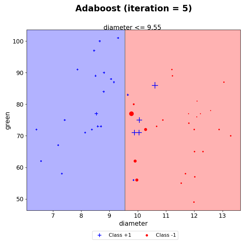
- 최종 예측
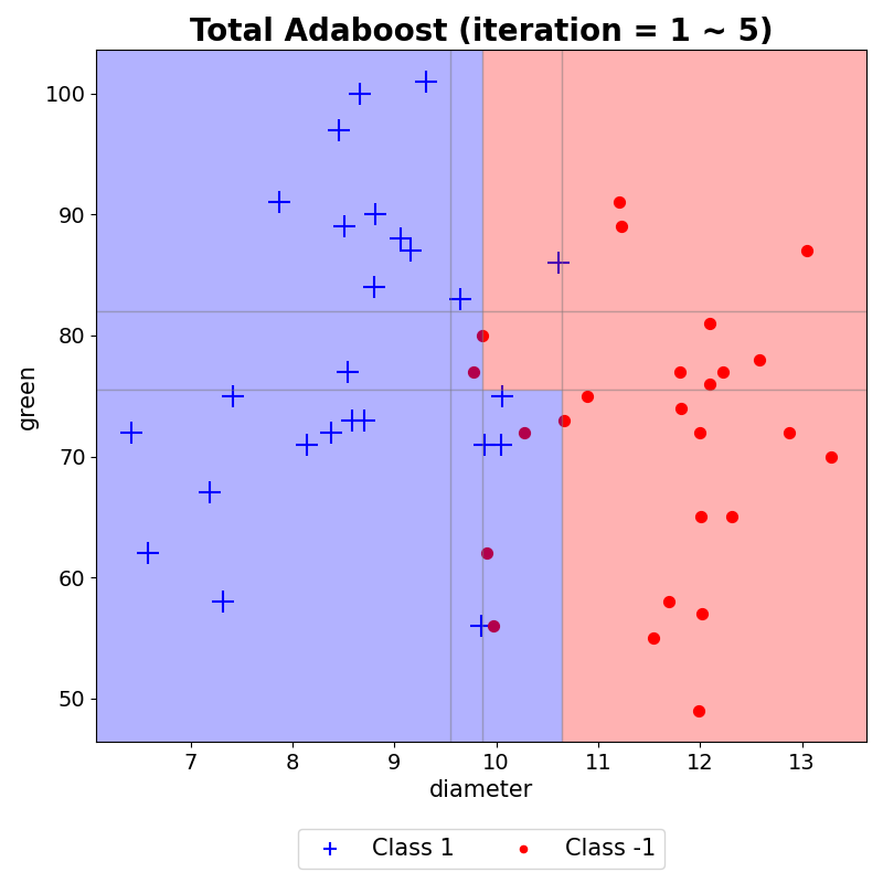
이러한 결과들을 모두 모아 AdaBoost의 최종 예측 결과를 시각화하였다. 이는 생성된 결정경계마다 AdaBoost 최종 결합 시 사용되는 $\alpha$를 반영하여 해당 구역의 예측값과 $\alpha$합들로 나타낸 그래프이다. weak learner는 하나의 결정 경계선만을 생성하지만, AdaBoost는 이러한 weak learner들을 모아 위와 같이 조합하여 결정경계를 생성할 수 있음을 볼 수 있다.
weak learner의 예측 결과에 따라 가중치를 반영하여 그린 분포는 아래 코드를 이용하였다.
'''
두 피처 간 예측 결과 그리기
'''

import matplotlib.pyplot as plt
from sklearn import tree

def plot(train_x, model, itr, f_name):

    # train_x: 훈련 데이터
    # model: 구현한 AdaBoost 모델
    # itr: weak learner 몇개인지
    # f_name: 피처 이름 리스트

    ### 그래프 그리기
    # 데이터 크기에 맞게 빈 플랏을 생성한다.
    # x축: 0번째 feature, y축: 1번째 feature
    plt.figure(figsize = (8, 8))
    plt.scatter(train_x[:, 0], train_x[:, 1], c= 'white')

    # 학습된 weak learner의 분류 경계 기준 가져오기
    weak_learner = model.model_list[itr]

    decision_path = tree.export_text(weak_learner).split()

    location = decision_path[1] # 어떤 피처로 분류했는지
    condition = float(decision_path[3]) # 값 기준이 무엇인지
    print(location, condition)

    # markersize가 weight을 반영할 수 있도록 설정
    positive = np.where(train_y == 1)
    positive_data = train_x[positive]
    positive_size = train_x.shape[0] * model.weight_list[itr][positive] * 50

    # markersize가 weight을 반영할 수 있도록 설정
    negative = np.where(train_y == -1)
    negative_data = train_x[negative]
    negative_size = train_x.shape[0] * model.weight_list[itr][negative] * 50

    # 빈 플랏 축의 최대, 최소값을 저장한다.
    x_min, x_max, y_min, y_max = plt.xlim()[0], plt.xlim()[1], plt.ylim()[0], plt.ylim()[1]
    plt.xlim(x_min, x_max)
    plt.ylim(y_min, y_max)

    # 만약 0번째 feature를 이용하여 데이터를 나눴을 경우 plot을 그려준다.
    # fill_between을 이용하여 선을 기준으로 왼쪽 오른쪽 공간을 색칠해준다.
    background_color = ['blue', "red"]
    if location == "feature_0":
        plt.plot([condition,condition], [y_min, y_max], color = 'gray')
        plt.fill_betweenx([y_min, y_max], [condition,condition],x_min, alpha=0.3, color = background_color[0])
        plt.fill_betweenx([y_min, y_max], [condition,condition],x_max, alpha=0.3, color = background_color[1])

    # 만약 1번째 feature를 이용하여 데이터를 나눴을 경우 plot을 그려준다.
    # fill_between을 이용하여 선을 기준으로 왼쪽 오른쪽 공간을 색칠해준다.
    else:
        plt.plot([x_min, x_max],[condition,condition], color = 'gray')
        plt.fill_between([x_min, x_max],[condition, condition],y_min, alpha=0.3, color = background_color[0])
        plt.fill_between([x_min, x_max],[condition, condition],y_max, alpha=0.3, color = background_color[1])


    # 두 feature의 그래프를 그리면서, label의 값에 맞춰 색을 칠해준다(1과 -1은 서로 다른 색으로)
    plt.scatter(positive_data[:, 0], positive_data[:, 1], c = 'blue', marker = '+', label = 'Class +1',s = positive_size)
    plt.scatter(negative_data[:, 0], negative_data[:, 1], c = 'red', marker = '.', label = 'Class -1', s = negative_size)

    plt.xlabel(f_name[0], fontsize = 15)
    plt.ylabel(f_name[1], fontsize = 15)
    plt.xticks(fontsize = 14)
    plt.yticks(fontsize = 14)
    plt.title('Adaboost (iteration = %d)\n'%(i+1), fontsize = 20, pad = 20, fontweight='bold')

    if condition == 0:
        pass

    # 분류 경계선 위 기준 넣기
    elif location == "feature_0":
        plt.text(round(condition,3) - (x_max-x_min)/10, y_max, '%s <= %s'%(f_name[0], round(condition,3)), fontsize=15)
    else:
        plt.text(x_max, round(condition,3) - (y_max-y_min)/10, '%s <= %s'%(f_name[1], round(condition,3)), rotation = 270, fontsize = 15)

    lgd = plt.legend(bbox_to_anchor = (0.72, -0.1), fontsize = 12, ncol = 2)
    for legend_handle in lgd.legendHandles:
        legend_handle.set_sizes([20])
최종 예측의 시각화로 사용한 코드는 아래와 같다.
'''
두 피처 간
AdaBoost 결과 시각화
'''

import matplotlib.pyplot as plt
import matplotlib.patches as patches
from sklearn import tree


def final_plot(train_x, model, f_name):
    fig, ax = plt.subplots(figsize=(8, 8))
    x, y = [], [] # x, y 좌표를 담을 리스트
    x_predict = [] # x = condition일때 예측 값을 담기 위한 리스트
    y_predict = [] # y = condition일때 예측 값을 담기 위한 리스트

    # set_iteration 값과 실제 stump tree의 개수는 서로 다를 수 있다. (오분류율이 0.5 이상이면 모델을 추가하지 않고 넘어감)
    # 따라서 model로부터 실제 만들어진 stump tree의 개수를 받아온다. (-> iteraion)
    for i in range(model.iteration):

        # 주어진 model로부터 어떤 데이터를 기준으로 나눴는지(-> location), 어떤 값으로 나눴는지(-> condition)에 대한 정보를 얻는다.
        weak_learner = model.model_list[i]

        decision_path = tree.export_text(weak_learner).split()

        location = decision_path[1]
        condition = float(decision_path[3])
        print(location, condition)

        # model이 condition보다 작거나 같은 경우 예측 값과 condition보다 큰 경우 예측 값(-> predict_set)
        predict_set = model.train_pred_list[i]

        ### 그래프 그리기
        # 데이터 크기에 맞게 빈 플랏을 생성한다.
        # x축: 0번째 feature, y축: 1번째 feature
        ax.scatter(train_x[:, 0], train_x[:, 1], c= 'white')
        # 빈 플랏 축의 최대, 최소값을 저장한다.
        x_min, x_max, y_min, y_max = plt.xlim()[0], plt.xlim()[1], plt.ylim()[0], plt.ylim()[1]

        # 0번째 feature를 이용하여 데이터를 나눴을 경우
        if location == "feature_0":
            x.append(condition) # x좌표
            x_predict.append([condition,max(predict_set), min(predict_set)]) # x좌표, condition보다 작거나 같은 경우의 예측 값, condition보다 크거나 같은 경우 예측 값, 알파 값


        # 1번째 feature를 이용하여 데이터를 나눴을 경우
        else:
            y.append(condition) # y좌표
            y_predict.append([condition,max(predict_set), min(predict_set)]) # y좌표, condition보다 작거나 같은 경우의 예측 값, condition보다 크거나 같은 경우 예측 값, 알파 값

    x.extend([x_min, x_max]) # x좌표의 최대 최소 값 담기
    y.extend([y_min, y_max]) # y좌표의 최대 최소 값 담기

    x = sorted(x) # x좌표 정렬
    y = sorted(y) # y좌표 정렬

    # x_num_data, y_num_data: x_predict, y_predict의 값을 데이터 프레임 형태로 표현
    x_num_data = pd.DataFrame(x_predict, columns = ['x', 'left', 'right'])
    y_num_data = pd.DataFrame(y_predict, columns = ['y', 'up', 'down'])

    # (x1, x2)와 같은 좌표형태로 표현
    x_coordinate = [[x[i], x[i+1]] for i in range(len(x)-1)]
    y_coordinate = [[y[i], y[i+1]] for i in range(len(y)-1)]

    # 각 구역마다 색칠하기
    for i in x_coordinate:
        for j in y_coordinate:

            # 특정 구역 x좌표의 최소, 최대, y좌표의 최소 최대
            condition = i+j
            min_x, max_x, min_y, max_y = condition

            # 특정 구역의 주변 알파 * 모델의 예측값 들을 담는다.
            upside = y_num_data[y_num_data['y'] >= max_y]['up'].values
            downside = y_num_data[y_num_data['y'] <= min_y]['down'].values
            leftside = x_num_data[x_num_data['x'] >= max_x]['left'].values
            rightside = x_num_data[x_num_data['x'] <= min_x]['right'].values

            # total: 알파 * 예측값들의 합
            # total이 양수이면 color = "blue", total이 음수이면 color = "red"
            total = sum(np.concatenate([upside, downside, rightside, leftside]))
            if total > 0:
                c = 'blue'
            elif total < 0:
                c = 'red'

            # 특정 구역 색칠하기
            ax.add_patch(patches.Rectangle(
                (min_x, min_y),
                max_x-min_x,
                max_y-min_y,
                edgecolor = 'gray',
                facecolor = c,
                fill=True,
                alpha = 0.3
                ) )

    ### train_x 데이터 표시하기 ###
    # label이 1인 positive data는 +모양, 파란색으로, label이 2인 negative data는 .모양, 빨간색으로 그리기
    positive_data, negative_data = train_x[np.where(train_y == 1)[0]], train_x[np.where(train_y == -1)[0]]

    ax.scatter(positive_data[:, 0], positive_data[:, 1], c= 'blue', marker = "+", s = 200, label = "Class 1")
    ax.scatter(negative_data[:, 0], negative_data[:, 1], c= 'red', marker = ".", s = 200, label = "Class -1")
    plt.title('Total Adaboost (iteration = 1 ~ %s)'% (hand_model.iteration), fontsize = 20, fontweight='bold')
    lgd = ax.legend(loc='lower center', bbox_to_anchor = (0.5, -0.2), ncol = 2, fontsize = 11)
    for legend_handle in lgd.legendHandles:
        legend_handle.set_sizes([80])

    plt.xlabel('%s'%f_name[0], fontsize = 15)
    plt.ylabel('%s'%f_name[1], fontsize = 15)
    plt.xticks(fontsize = 14)
    plt.yticks(fontsize = 14)

    plt.xlim(x_min, x_max)
    plt.ylim(y_min, y_max)

    plt.tight_layout()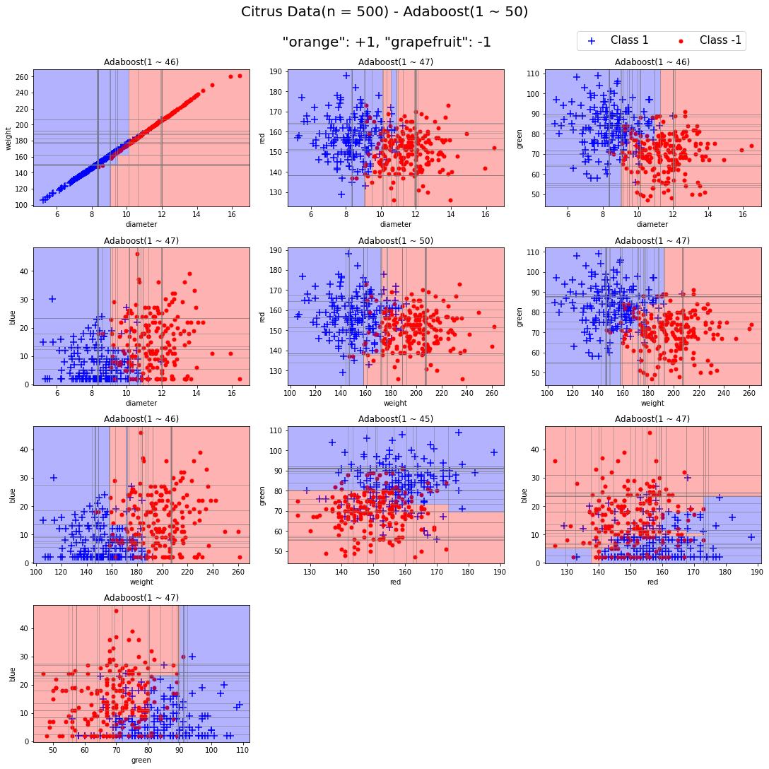
이를 모든 피처 조합에 대해서 50번의 iteration을 거치면 위와 같은 결과를 내보낸다. 이처럼 AdaBoost Classifier의 시각화를 해볼 수 있다.
- 참고
AdaBoost Classifier의 분류 결과를 시각화 하는 개념을 좀더 자세히 보고자 한다.
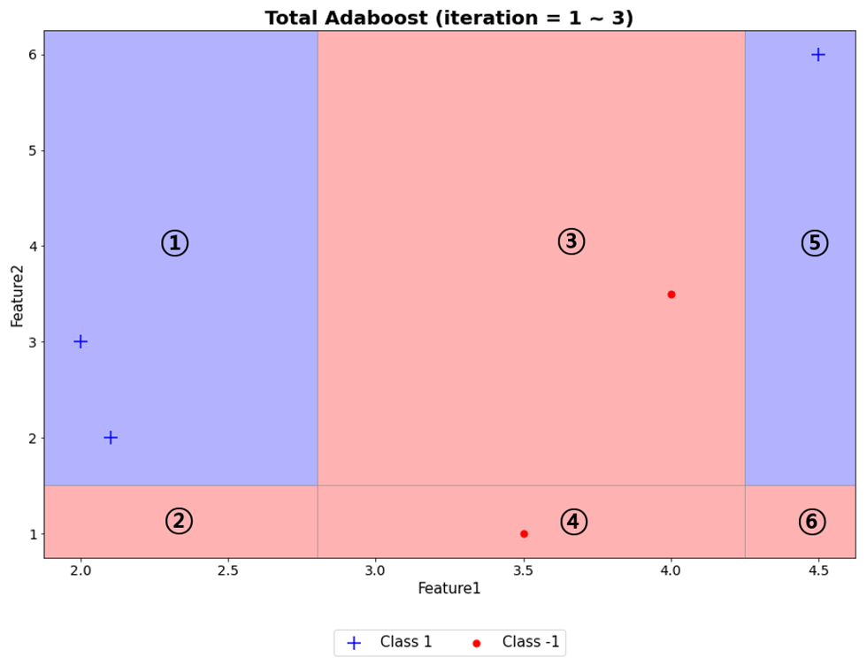
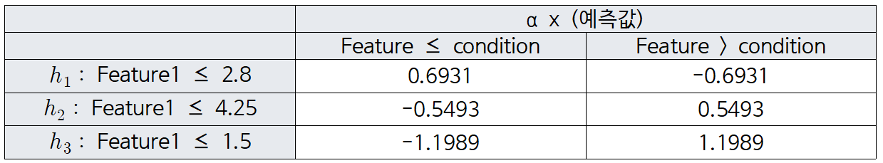
5개 예제에 대한 weak learner를 3개 생성했을 때, 위와 같다.
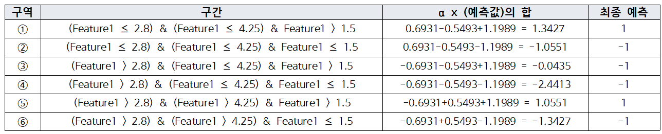
이를 이용해 구역을 나누면, 6개의 구역이 나타난다. 이제, 각 구역마다 예측값에 $\alpha$를 반영해 최종 예측한 값을 계산한다.
오늘은 실제 데이터를 이용해 AdaBoost Classifier를 구현해보고 이를 비교하고 시각화하였다.
다음시간에는 Gradient Boosting Regressor를 보고자 한다.
'손으로 직접 해보는 모델정리 > 앙상블 모델' 카테고리의 다른 글
| [Boosting] Gradient Boosting Regressor (0) | 2023.04.28 |
|---|---|
| [Boosting] AdaBoost Regressor (0) | 2023.03.28 |
| [Boosting] AdaBoost Classifier (0) | 2023.03.24 |
| 앙상블 학습 방법 (0) | 2023.03.24 |


